
You might have noticed something different. Yes, IRAGINATION is sporting a new site design. I rolled it out a few days ago. But maybe more intriguing was the fact that I kept completely silent about it during these days. Sorry about that, that’s just how busy I am sometimes. Anyway, at last, I can sit down and write about this recent change.
Is this what has kept me busy since my previous update? Unfortunately yes. I’d like to tell you I’ve been working on something else, but I really don’t have a big update for Bass Abyss or something else just yet. This was something I had to get out of the way first, it was a pretty big deal to get it done so I won’t let it go as some casual change. I have to make a big fuss about it to feel better.
Responsive Web Design
There are a lot of guides about Responsive Design out there, so I can’t add much on the subject that you couldn’t find on a Google search. But I can tell you why I did it and how was my experience converting my site.
It is all about devices and screen resolutions. Long gone are the days you’d worry about just the desktop experience of a website. There are just too many screen configurations out there and it gets very annoying to see your site break in many of them. Maybe not a disaster, but the previous design was not usable at all. Put up with pinch-zoom and scroll bars? Maintain an alternative website at m.iragination.com? Not going to happen with my little free time.
This wasn’t just a problem of small screens on mobile devices and tablets. The problem of usability and presentation was getting alarming with large screens too. The previous design was supposed to stretch and fill the full viewport, a fitting solution at the time. But that was okay back then when 1024 pixel screens were the norm. With modern screens, the resulting line length of paragraphs was getting ridiculous.
Also, any solution I could think of had to deal with the three main types of pages that existed on my site. WordPress pages, Coppermine pages, and my static web pages. Worpress and Coppermine have completely separated code bases and template systems. My ideal solution would be to have a single template in place, but any endeavor to get a solution like that quickly hit a wall of bricks that required code duplication or some horrible workaround that I didn’t feel like solving, especially when I was working in other more exciting projects. These applications just didn’t seem to get along in the way I wanted, and there were no quick solutions on their respective project sites or forums.
By the time I started to hear about Responsive Design and saw the good results on some sites that implemented it, I realized that eventually, I’ll have to code my own solution too. The browsers finally were ready, there were enough accessible devices out there, the documentation and techniques had matured. I just had to sit down and learn about it, whatever the time it takes.
While the tutorials were nice and they’ll always tell you how awesome their techniques were, I knew that I was not going to find a solution for my particular problems with Worpress and Coppermine, this was something I had to solve myself. So I took an easier to hardest approach.
Static web pages
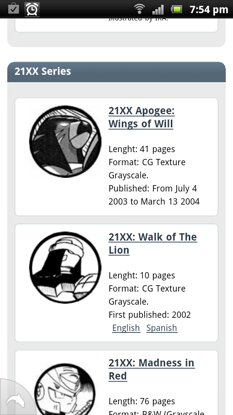
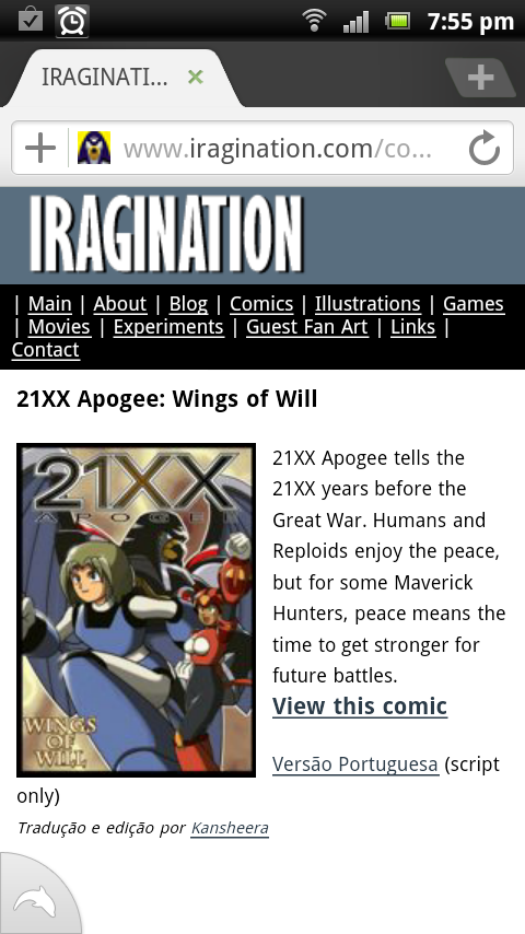
First I converted my static web pages as a proof of concept. I had already converted my comic pages back in June with very good results, but the static pages were going to be the first ones with the true new design. The usual recommendation is to design for mobile-first. Do the simplest thing that could possibly get your content nicely shown. Then for large screens add anything else on the sides (sidebars, more columns) to fill the extra real state. Luckily I was in a pretty good position to do this since the structure of my static pages was pretty simple. Text, images and that’s about it. The layout used to fill the screen because it was stretched.
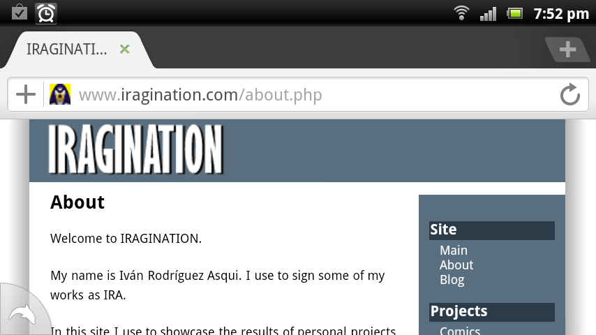
Home Page
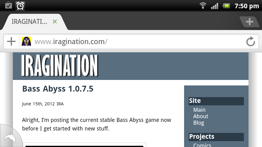
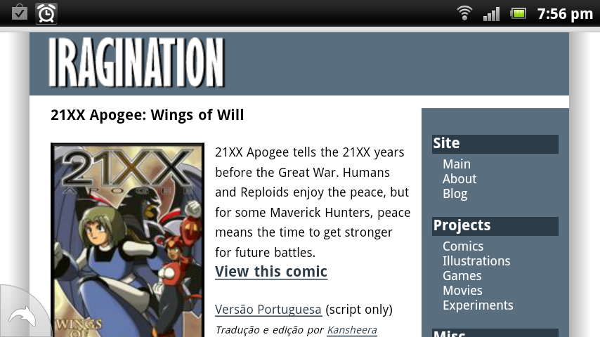
I went with the site logo on the top and navigation options that would adapt depending on the horizontal space. I used a CSS feature called Media Queries that allows you to switch the styles applied to the document depending on the viewport’s width. For large screens, I decided on a maximum width of 950 pixels to solve the problem of absurd line lengths. Small screens use the full width, hide the navigation items in the sidebar, and place a new horizontal navigation at the top.
The wonderful thing about this is that you can test all of this on your desktop by just changing the window size of your browser. I removed all the image files that served as decoration like shadows or gradients, and went with native solutions using CSS3 borders and drop shadows.

Internet Explorer shenanigans
While everything went smoothly with Firefox, Chrome, Opera, and Safari, I knew I was in for a tough road with our dear friend Internet Explorer. None of these techniques would work on version 8 and earlier. The beautiful drop shadows on the sides? Gone. Media Queries? Haha, good luck with that.
I was ready to just drop support for IE if I didn’t find a solution in a reasonable amount of time. Fortunately, I did. A project called css3-mediaqueries-js allowed me to just drop some JavaScript file in and have IE detect and apply the layouts for small screens and large screens. Awesome!
Still no drop shadows so I decided that IE8 and early users will just have to settle with a simpler but functional design. I didn’t plan to spend a single second more to get it look exactly like in other browsers. On the other hand Internet Explorer 9 supports all this out on the box without any hacks, making it a really nice browser at the moment.
Internal pages
The previous step covered all the comic pages, the games, the movies, the experiments, and other miscellaneous static web pages. I had to roll out my own view class to keep things tidied up nicely and in order to reuse portions of the layout code for what was coming next.
WordPress
Next was WordPress. Yes, I decided to leave Coppermine for the last since it was the deal-breaker and I didn’t want to shatter my hopes very soon. In the worst case, I’d settle with some exclusive solution for Coppermine if needed.
WordPress is very nice in the sense that allows me to focus on posting new stuff quickly and not to worry about setting up new static pages. Also, It is dead simple to keep it up to date and that is a good thing since you can count on a large community of developers actively reviewing the code, rolling out patches and bug fixes quite often.
The code itself, on the other hand, let’s just say I’m used to another style of coding and I don’t really like to mess up with spaghetti code unless required.
My problem should be simple enough. WordPress uses a template system based in themes, so essentially this was about creating a new theme that reused the code of my static pages as much as I can. My previous theme has been in service for years, so inspecting the new modern themes should be straightforward enough.
Unfortunately, the sample themes were very complex and intimidating in their own right, with many files, large portions of PHP code, and the most intriguing overriding techniques for function calls can only qualify as horrible hacks, but maybe I’m just not familiar with their coding style.
Still, the plan was the same. Just copy over the smaller set of template files to do the overrides I needed, and prune from them all the code that I did not need.
Soon I realized that I was going to need my View class for this to work the way I wanted. It really worried me that I was going to get problems with name collisions between my classes and WordPress’s liberal use of the global namespace, but fortunately, I didn’t.
It accepted my View class without conflicts. I knew it was not going to be the cleanest solution, something that I could pack in some plugin and share with the world but at least for my very special needs it worked fine and soon I had a new functional theme integrated with my own framework. Still, this is something that I expect to revisit again in the future to prevent name collisions. With this, the front page was solved.
Coppermine Gallery
Lastly it was the turn for Coppermine. I had to be very frustrated to write such a rant about Coppermine in the past. Well, I was about to find another reason to be even more frustrated.
Table-based layout
How many times this year I gave up in the middle of a redesign session because of Coppermine? After having Worpress and my static pages being responsive, having Coppermine breaking everything else with its table-based layout was not an option. So, what’s the problem? Well, as I mentioned, it is about tables. The way Coppermine displays the grid of thumbnails is by using tables with a fixed amount of rows and columns.
Every time you see a page with a grid of things that fluids nicely when you resize the browser window, that is not a table, those are HTML div elements. Floating divs. If I were not going to be able to get Coppermine to do this, the result was going to be that only for the gallery pages I was going to get horizontal scroll bars on small screens. Not acceptable. I felt that I had enough experience and tools to solve this problem so I was not going to compromise.
Template system
Since Coppermine also has its own template system based on themes, I expected it would be only a matter of finding the code that produces the grid as tables and override it to produce divs.
At first, this looked like a less intimidating task compared to WordPress, since in order to override the base theme layout all you had to do is place a single theme.php file in your new theme folder. I had a prototype running quickly but then I noticed that the function I was overriding was also called to build pretty much all the layout on the admin section, and those pages did expect tables! So they quickly broke, and there was no simple way to fix this. Since I didn’t want to deal with this, I decided to switch to plan B.
jQuery hacks
What I use to do in cases where the backend doesn’t produce the markup I need is just to convert in on the fly with jQuery. So essentially Coppermine is still happily producing its table layout, but I also serve a script that detects the pages with thumbnails tables and converts the rows and columns to floating divs. You would not imagine how proud I felt when I had this working. This was it, the most problematic set of pages were finally solved. The gallery was responsive. The site was completed!

I wouldn’t call this an easy fix and if the Coppermine developers expect us users to do this kind of work, I think they are expecting too much. Oh, and I took the fact that the latest version of Coppermine was packed with jQuery 1.3.2 as a handicap just for laughs. Even with my experience, I had to do a fair amount of research to get this done.
Let alone I didn’t see any trace of responsive design talk on Coppermine forums, so it was not evident for me if this issue was on their roadmap or they pretended to keep using table-based layouts for good.
Of course, this must be breaking very hard for browsers with no Javascript support, but I really don’t expect those to support Media Queries, to begin with.
Final Results
And so, as you can deduce from the amount of text of this post, this is a topic that has kept me very interested and entertained for a good while. As usual, the work never ends and I expect to do more changes and adjustments as I get a hold of new devices to test, but this should have covered all my design needs for a while! If you have a website this is a very good time to research these subjects. Smartphones are pervasive and old devices are on the way out.
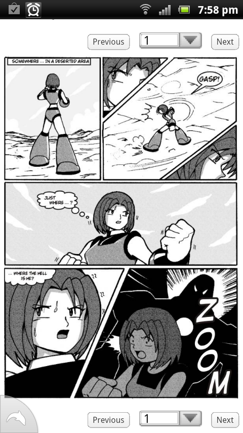
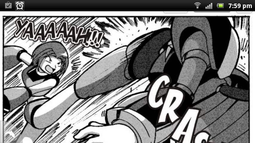
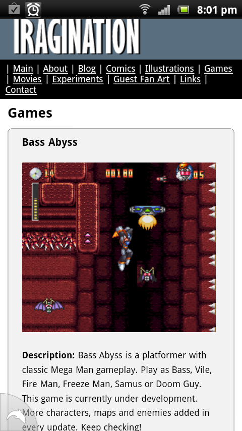
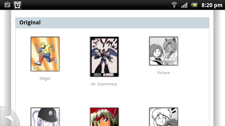
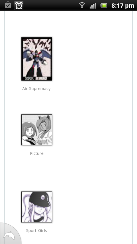
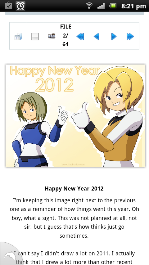
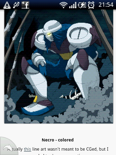
Here are some really small screen use cases. Devices used were Xperia Play and Xperia Mini. Happy coding!
Portrait home page. 480×800 Comic page listing. Comic introduction. 
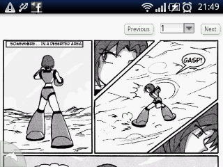
Landscape view of comic page. Thumbnail listings. Landscape view. A full size picture view. 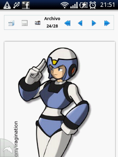
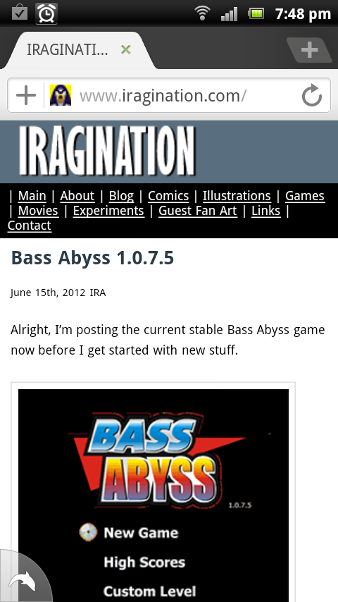
Game page converted.